


Overview
Problem: Transit officials in St. Louis have identified a problem that they want to solve. Due to expansion, numerous bus routes have been recently added. Many of those routes stop at the same bus stops and now it’s more difficult for riders to know when their bus is arriving. Technology exists to determine how far away each bus is from a stop, but not the means to share that information with riders.
Business Requirements:
1. Ensure that any rider can tell when each of the buses arrives at the Washington & State bus stop.
2. Ensure that all riders can tell how much time they have to get to the Washington & State bus stop before the bus they need arrives at that stop.
3. Allow riders to select one of seven bus lines to see a list of its future arrival times at the Washington & State bus stop.
Audience: St. Louis residents, ages 18 to 44
Objectives: Meet client’s business requirements with a focus on finding how to best serve the largest segment of bus riders.
Solution: Simple tab menu allows users to easily navigate between the app’s different features. Users are able to start a search, view nearby bus stops, or access favorites with one click from anywhere within the app. The addition of a ‘Favorites’ feature allows commuters, the largest segment of riders, to find the exact information they need in a matter of seconds.
Team: Individual project; feedback/support: peers and mentor
Roles: UX Researcher, UX Designer, UI Designer
Tools: Typeform, Maze, Otter.ai, Figma, Adobe Color, Photoshop, Canva, and Microsoft Excel
Duration: 4 weeks
Design Process
Jump to.....
Discover

Research Summary
I started my research with the goal of finding answers for the following questions:
-
What information is most important to riders?
-
How does this information impact which transit app they use?
-
What pain points are users experiencing when taking the bus?
-
Can an app help to reduce rider frustrations?
For my first research activity, I conducted a competitive analysis to evaluate:
-
What information is available on competitors apps
-
How is that information was displayed
-
Would these display formats work favorably with the business requirements for my app?
Next, I conducted a user survey to learn more about bus riders’ demographics, preferences and pain points. Through the quantitative data I was able to gain insights into potential users.
The qualitative and attitudinal data collected by this survey helped me determine what respondents most wanted from a transit app, but I had yet to learn about HOW they were using these apps.
As I got ready to start the user interviews I knew that I would need to approach from a behavioral research angle in order to learn about the actual process of using an app to facilitate traveling by city bus.
Interviews began with questions about when they use transit app:
-
At what point do you open up a transit app?
-
Why at that time?
I also wanted to know how they make decisions and based on what information that they were getting from app ?
From the survey data I knew waiting was the #1 complaint so I also gathered attitudinal data about interviewees' experiences with waiting and if their app impacted the amount of time they waited.
The interviews not only provided me with important details, but also sparked some ideas for features. Following interviews with two commuters, each of whom described opening their transit apps to check bus status about 30 minutes before it was due to arrive, I realized that favorites would be a useful feature to add.
Competitive Analysis

Transit's strengths:
-
Option allowing riders to easily access specific bus lines
-
Unique feature: on-time rating (%) for each bus line
Google Maps' weaknesses:
-
Lacked features that were found in other apps.
-
Bus lines can only be viewed within a trip
-
You can’t favorite or pin bus lines
-
You can’t get alerts about bus lines.
User Surveys
Out of 30 participants,
Aged 18+ who have taken a public bus in past 10 years:
When asked what they most dislike about riding the bus:
70% : Commute by bus
55% : Waiting
90% use a transit app when taking the bus
What influenced decision to use one transit app over another?
63% : Provides real-time information
58% : Shows multiple future arrival times
What could be improved about their favorite transit app?
Which features would they most want in a new transit app?
60% : Doesn't account for changes to service (delays, detours, etc.)
66% : Accurate & continually updated arrival times
Insight: Riders made the importance of real-time information abundantly clear through their responses to:
-
what influenced their decision to use current transit app
-
what could be improved about current transit app
-
what they would most want in a new transit app
User Interviews
Biggest Takeaway:
Commuters and leisure travelers have different needs when it comes to what information they want and even how it’s presented.
Interesting! Even if someone was taking bus both to commute and for leisure, their behaviors and expectations shifted according to their reasons for taking the bus.
User Persona

Meet Jane Ryder
Our 26-year old persona resides in St. Louis where she works in communications.
Motivations:
-
Uses technology to make life easier.
-
Appreciates simplicity and ease of use in mobile apps.
-
Takes bus because it’s convenient and low cost.
Goals:
-
Commute should be simplest part of her work day.
-
When commuting, she only wants to see information that pertains to her route.
Frustrations:
-
Avoids transfers whenever possible.
-
Weather (rain/snow) can make commuting challenging.
Define

User Stories
As a bus rider, I want to know when my bus is arriving at the Washington & State bus stop, so that I can calculate how much time I have to reach the bus stop.
As a bus rider, I want to know the next bus arriving at the Washington & State bus stop, so that I don’t rush to the bus stop if it is not my bus.
As a bus rider, I want the ability to view future arrival times for any of the seven bus lines (serving Washington & State), so that I know when my bus arrives.
As a bus rider, I want to quickly access arrival times for my bus & bus stop, so that it’s easy to see when my bus will arrive and if it’s running on time.
What's the deal with the pink rectangle? Let me tell you!
This user story was added in response to the needs and behaviors of the largest segment of bus riders, commuters:
-
Taking bus significantly more often than leisure travelers.
-
Looking for the same information every time.
-
Only need to see limited information: what time the bus will be arriving at a certain stop. Having to continually re-route entire trip, is a big waste of time.
By providing commuters with:
-
Easy access to their favorite (ie frequent) routes.
-
Prioritizing the information they most often seek.
-
List view that sorts automatically to show closest stop first.
Commuters are able to find out what they need to know in a matter of seconds.
User Flow

Other Features Considered
Idea: Alert to signal that you're bus is approaching
What if her phone alerted her (ex: a unique vibration) when it sensed that bus she had routed was approaching her current location (ie the bus stop she was waiting at)?
Reasons not pursued:
Interviewee behavior:
Interviewees had said that they were not using the alerts already available to them, such as notify me when to leave (especially unimportant to riders when travelling for leisure).
“I think you probably could have set up notifications and things like that…. [but I would] just have [app] open.”
- Interviewee #3 discussing her typical routine when commuting
Inspired by:
“I have to check it about 17 times because I always forget. Some other bus will come up and I'm like, 'Was my bus 26? I don't remember.’”
- From interview with leisure only bus rider
Survey results:
What do you most want in a new transit app?
45% : alerts about service status (potential delays or detours)
66% : accurate and continually updated arrival times.


Sketches

Initial review of business requirements with a focus on what information riders need and how might they want it to be presented.

In these sketches I was also brainstorming different ways that information could be displayed.


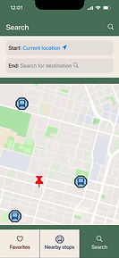
Low-Fidelity Wireframes & Prototype


Low-Fidelity Usability Testing
Participants:
Four participants (3 females, 1 male, ages 35 - 38) used Maze to evaluate a clickable prototype made of low-fidelity wireframes.
Tasks:
-
Copied from user stories
-
Upon completion of each task asked, “There were several ways to complete this task, please help me understand your thought process & why you chose the one you did.”
Major Findings & Insights:
-
Tasks did not direct or encourage users to use a certain path or try different paths (critical)
-
Areas clicked that were not expected so were not ‘activated’ (serious)


Conclusions:
If there had been enough time, I would have run mid-fidelity usability tests since the insights from this round were so limited.
Goals for next round of testing:
-
Ensure that tasks encourage participants to interact with different parts of app
-
Avoid mis-clicks caused by limited functionality of app
-
Avoid previous confusion about inactive elements of tab menu

Develop
Design Principles
While working on taking wireframes from low- to mid-fidelity, I made a few edits based on some key design principles.
Type Hierarchy
The most important, or most critical, information is in the biggest font, and the least important, or least critical, information is in the smallest font
Proximity
Low-Fidelity

Mid-Fidelity

Some ambiguity about what distance was being measured. Placing in closer proximity to bus stop name provides greater clarity for user.
Directions reformatted for improved clarity.
Low-Fidelity
Mid-Fidelity


Time
Ex: On bus stop detail pages, arriving buses are listed soonest to latest.
Location
Ex: On Favorites page, bus stops are listed in order of closest to furthest away.
Mid-Fidelity Wireframes

v3_3x.png)

v3_3x.png)


Mood Board & Color Palette

With the mood board I wanted to celebrate St. Louis’ vibrant past and historical significance, which these days risks being overshadowed by sports, breweries and riverboat casinos.

Brick Red: Historically St. Louis was an important industrial city and home to many factories, which were often made out of brick.
Delft Blue & Jordy Blue: A reference the importance of the Missouri River, especially during expansion to the West when it served as the starting point for the Lewis & Clark expedition.
Hooker's Green: When it comes to urban public parks, St. Louisans are very proud of Forest Park due in part to it's incredible size: 1,326 acres.
(For comparison, NYC’s Central Park is 843 acres.)
Alabaster & Gunmetal: These neutrals were pulled from mood board imagery.
When choosing this color palette it was important to me that the contrast ratios would pass AAA tests.
Typography & Logo


Heading 6
Whenever I thought about a potential logo, I kept seeing a double lined font, which I thought would be a nice reference to movement and pathways. I found one I liked online and then used Photoshop to try different ways of breaking up the individual letters. Ultimately I kept it very simple to maximize legibility.
I used only San Francisco Pro Display throughout the app to maximize legibility. I kept font sizes large when possible to make it easier to process the information being shown.

Deliver
High-Fidelity Wireframes & Prototype


V5_3x.png)
V5_3x.png)


V5_3x.png)

High- Fidelity Usability Testing
Participants:
Seven participants (3 females, 4 males, ages 25 - 36) completed a series of 4 tasks independently using Maze to evaluate a clickable prototype made of high-fidelity wireframes.
Between tasks, they were asked about:
-
Their expectations about how app would function
-
Ease of use
-
Their thoughts about selected screens
-
Overall impressions
Quotes from overall impressions:
"The consistency of the layout/display and colors used was a successful look for the app design. There was little to no confusion while using the app."
"Simple navigation made sense and displayed appropriate information."
High-Fidelity Usability Report

Green = 0 mis-clicks
Nude = 1 mis-click
Pink = 2+ mis-clicks
Overall the mis-click rate was good, but some elements still required editing to improve clarity and user experience.
Overview
Findings: critical
-
Changing how tab menu functions
-
Color & header added to search pages
Findings: medium concern
-
Bus arrival vs. arrival at destination
-
Clarifying favorites
Findings: minor concern
-
New color for start buttons
-
Route not drawn on map
-
Changes for buses arriving in more than an hour
Findings: Critical
Changing How the Tab Menu Functions
Previous Version
Inactive option

Active option

Update
Inactive option

Active option

“The green on the search icon background is different on this screen than the other and is easier to see.”
This comment made me realize there was a cognitive disconnect between how the tab menu worked and what user was perceiving.
Users were not interpreting as active vs. inactive elements (as I had intended), but instead thought inactive meant selected.
This change in menu function made it necessary to adjust green to a darker shade in order to maintain accessibility standards.
Color & Header Added to Search Pages
In conjunction with updated tab menu, adding a large header to Search pages will provide greater clarity for the user.
Previous Version

Update

Findings: Medium Concern
Bus Arrival vs. Arrival at Destination
Previous Version

Update

“The bus is going to arrive at 12:08.
That’s probably what that means.”
The above quote came from one participants' vocalization of their thought process. While the participant ultimately understood, any hesitance about vital information signaled to me that improvements could be made.
-
‘Walking to’ was amended with additional of ’bus stop at’ in order to provide more clarity about destination.
-
A partial vertical line was also added to enhance the visual separation of information.
Clarifying Favorites
Previous Version

Update

“I’m not sure what the favorite items are. Are they their favorite bus route? Or is it their favorite bus stop? Or is it their favorite bus line? Not sure.”
When one participant made the above comment, I realized that I wasn’t actually sure. I had been focused on giving commuters only the relevant details (bus stop name & arrival time for their bus line) and had failed to realize that what I was actually displaying was a piece of a route. Full route details aren’t necessary for daily commuting, but this information is still relevant and should be accessible to user.
-
I started by changing ‘Stop:’ to ‘Route departing from:’ as that provides more clarity about what information is being displayed.
-
Previously, link to additional arrival times was labelled ‘More details.’ Updating to ‘More times’ provides greater clarity about what user will see if they click on link.
-
In updated version, “More details" now gives user the option to see the rest of the information about the saved route.
UI Elements

Updated High-Fidelity Wireframes & Prototype


V6_3x.png)
V6_3x.png)
V6_3x.png)


Final Thoughts
SLAT successfully meets all client requirements while also providing additional value to commuters, the largest segment of riders. With more time I would have liked to complete another round of usability testing to determine if any additional revisions need to be made.
To me, the biggest win was that I was able to look at participants' actions, figure out the disconnect (the why), and understand what needed to be changed all on my own. One such example: when I understood that participant was interpreting menu item as selected when I had intended for it to read as inactive.
Ready for more?
Moving to maintain health while aging


Package theft prevention + more.