


Part planter + part lockbox = 100% secure
Heading 6
Protection that grows.
Summary: An aesthetic solution to package theft, the Grow-tection secure planter and its companion smartphone app make tracking and securing packages as breeze. Through the personalized notifications, based on package importance, users control what's 'need to know'.
Are you on track?
Overview
Problem: The existing solutions for package theft prevention are unattractive, problematic, or inconvenient.
Objectives: Provide a more secure, attractive, and convenient solution for preventing package theft on the users terms.
Solution: An aesthetic solution to package theft, the Grow-tection secure planter and its companion smartphone app make tracking and securing packages as breeze. Through the personalized notifications, based on package importance, users control what's 'need to know'.
Target Audience: Homeowners aged 25 + living in the United States who have experienced package theft personally or seen rise of thefts in neighborhood.
Team: Individual project; feedback/support: peers and mentor
Roles: UX Researcher, UX Designer, UI Designer
Tools: Google Forms, Maze, Otter.ai, Figma, Adobe Photoshop, Adobe Fonts, WebAIM's Contrast Checker, and Adobe Color's Color Blind Safe Tool
Duration: 4 weeks
What is the Grow-tection Planter?
The latest solution for package theft:
Grow-tection is part planter, part lockbox and 100% sleek and secure.
How does it work?
While it might look like a standard large rectangular planter, it hides a secure package storage drawer that is operated by keypad or smartphone app.
The Grow-tection secure planter uses the last four digits of your packages' tracking numbers as a unique, every changing access code.
This also means that you don’t have to worry about adding delivery instructions or risk a universal code that could fall into the wrong hands.
& Its Companion Smartphone App
An added bonus:
The Grow-tection app can be set up to fully automate package tracking and keeps you up to date based on personalized notification settings.
The Grow-tection app uses ‘tags' to easily apply different notification settings to different packages.
We get it: you want more information when it’s your new iPhone and less when it’s toilet paper
Design Process
Jump to.....
Discover
Research Summary
Online Shopping
Shipping
80% of American consumers shop online
(Statista)
Direct home delivery primary reason for shopping online
(Statista)
(PC Online)
78% of online buyers shop at least once a month
39% of customers track their packages at least once a day
(Shippo)
Package Thefts
Depending on the year and the source consulted, the national average of American adults who have had at least one package stolen in a given year range from:
14% to 23%
When asking have you ever had a package stolen, that number jumps to:
54%
A university study of 67 YouTube videos of package thefts showed that obstacles like a fence, gate, visible cameras, or even the presence of cars:
did not deter the criminals
Competitive Analysis
Indirect Competition
Weakness or Differences
UPS, USPS, FedEx, and Amazon all offer lockers and/or alternative pick up locations for free.
Not convenient for recipient:
- Availability depending on where you live
- Requires an extra step (i.e. driving to another location)
- Since each carrier has partnerships with different retailers, not centralized solution.
Citibox: Company based in Spain that produces keypad accessible lockers designed to go in lobby or mailroom of a building- such as for apartment dwellers
Grow-tection focused on people who live in homes, condos, townhomes, etc. who do NOT have access to a secure mailroom.
GoLocker: Describes itself as an out-of-home delivery solution for anyone, any brand, anytime. Locker units look very similar to those used by stores (such as Home Depot) for online order pickups.
- Only available in LA or NYC.
- Package must be shipped to their warehouse.
- Must pick up from locker within 48 hours.
- Fees: $5/package; $20/month for up to 10 packages;
$30/month up to 20 packages.
(Almost) Direct Competition
Danby Parcel Guard
Standard Locked Box Options
Strengths:
- Two way voice communication
- Camera & motion detection
- App based with notifications
Weaknesses:
- Anti-theft drop slot (still allows for someone to place unwanted items inside).
- Made of "web plastic" and unattractive.
99.9% of options online use lock & key to secure/access packages.
Key loss: such an expected reality of life that one company whose exclusively produces locking boxes even states on its website that:
“A lot of people lose their keys (I’m sure you won’t) so register & we will keep your key # on file.”
Most of these locked box options also use drop slot, which would allow someone to place unwanted items inside.
User Surveys
User Survey Results
(11 participants, ages 18-79)
National Survey Data
(for comparison)
(C+R Research, 2022)
100% of participants
report that they receive at least one package per month
91% of participants
report that they receive at least one package per month
45% of participants
report that they receive packages at least one day per week
(36% at least once a month; 18% daily)
55% of participants
report that they receive packages at least one day per week
Additional Data from User Survey
How are they tracking packages?
64% are pulling up an email with tracking information
On day of delivery, how often are they checking the status of their package?
45% at least once
36% only if delivery window has passed
18% a few times
User Interviews
Conducted with three women
(Aged 25 - 75)
Provided a range of different experiences when it came to: how often they receive packages, how & how often they track, and their experience with package theft.
99.9% of the time they track from their smartphones
Feel it's too much trouble to opt-in to hold, delay, or reroute options for package deliveries.
Opt-in to text notifications related to tracking when available.
Important Insight: Package Value
Cost of item(s) is NOT the only factor considered when deciding how valuable they perceive a package to be; also ranking items as valuable if in need of the item(s).
"I think there are two things:
if it’s something I need and want right away.
I don’t want it to be stolen…So either high value or something that you really need.”
(This perceived value has an influence on behavior, for example: how often they are tracking a package.)
Delivery Windows: Less Tracking
If recipient has a delivery window, they are less likely to check tracking again, until or unless that delivery window has passed without package being delivered.
"After I kind of know the [delivery] window, I don't check again."
Shift in Focus of App as Result of Interviews
App should also include package tracking
During these interviews I realized that if I created an app with the focus only on package theft prevention and lockbox access, I would not be addressing users needs when it came to being informed about their deliveries.
Tracking requires more information
Originally I had thought that users would only supply the last four digits of their tracking number in order to inform planter about the codes that should open storage drawer.
I had considered having a voice input option, but now it was not going to be feasible. Not only were all interviewees adamantly against using voice input (even for a mere 4 digits), but also that number had now ballooned to up to the length of an entire tracking number: anywhere from 9 to 22 digits long!
User Persona

Meet Tracey Packett
Tracey Packett is a 38 year old freelance designer.
Motivations:
-
Values efficiency and convenience
-
Wants to minimize interruptions during working hours
-
Seeks streamlined or automated processes.
Goals:
-
Effortless package tracking from smartphone.
-
Wants to know package will be secure even if she can't bring it inside right away.
Frustrations:
-
Visiting multiple websites to track packages.
-
Overall high volume of notifications and emails.
Define
User Stories
As a new user of the Grow-tection app,
I want to create an account by connecting my email account so that the tracking of my packages will be fully automated.
As a user of the Grow-tection app,
I want the option to manually add a package so that I can track and accept packages when I don’t have an accompanying email.
As a user of the Grow-tection planter,
I want to be able to unlock and open the planter’s package storage drawer with my smartphone.
As a user of the Grow-tection app,
I want to control notifications so that I receive relevant package notifications and minimize unnecessary alerts.
As a user of the Grow-tection app,
I want to know when new packages have been added to tracking so that I can easily apply appropriate notification tag.
User Flows

User Flow #1: Log in or sign up
User Flow #2: Open planter's storage drawer


User Flow #3: Manually add package
User Flow #4: Notification settings for tracked packages- 'tags'


User Flow #5: Add tag to newly tracked package

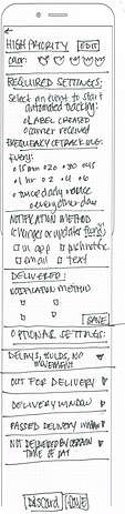
Sketches


Notification Settings : Crazy 8s + Sketch

Label Settings : Crazy 8s + Sketch

Add Package : Crazy 8s

Package Details : Crazy 8s


Low-Fidelity Wireframes


Develop
Design Principles
Nielsen's Usability Heuristics
User Control & Freedom


Undo added to all non-destructive actions.
Error Prevention


Warning and confirmation step added for all destructive actions.
Improving Selection of Notification Settings
Maeda's Laws of Simplicity: Organize + Progressive Disclosure
Before
After


Organize: By rearranging, and better organizing, the options for automated tracking frequency, I was able to make the many (potentially overwhelming number of choices) appear fewer and more manageable.
Progressive Disclosure: By breaking up the required settings across two screens I was also able to reduce user's cognitive load by only asking them to focus on one type of choice at a time: first frequency, then notification method.
Mid-Fidelity Wireframes


Mood Board & Color Palette


Mood board: I looked for images of planters similar to how I imagine the Grow-tection planter to look and as well as locations were I thought it would be put. I looked to flowers that might be growing in a planter to influence the color palette. I especially loved the movement and shape of the potted geranium from the mood board.
Color Palette: I started by selecting blue as I felt it was important to convey trust. I originally looked for images of orange flowers to create a complementary color scheme, but found that I was also drawn to all the green foliage in the images. By opting for a red-orange I was able to create a split complementary color scheme using both blue and green.
Typography & Logo

I decided to keep the typography simple as it would ensure good legibility. I used SF Pro Display throughout and took advantage of its many different line weights when establishing hierarchy.


During the Discover phase I kept running into issue of not know how to quickly refer to this product. It didn't feel right to call it only a lockbox or only a planter so I completed a mind-mapping exercise to try to come up with a name. Eventually I landed on Grow-tection.
I sketched two logo ideas that came to me out of the blue while working on the Define phase. The second idea provided the basis for the final logo. I explored shaping the arrangement of "grow" to more closely resemble the organic, floral shapes in sketches, but found that legibility was too compromised.
Style Tile & Accessibility

Color & Contrast
I ensured that all colors were compliant with at least AA standards on WebAIM and used Adobe Color to make sure that they were also color blind safe.
I researched the standards for color contrast between the container of a button and the background of page to ensure that these standards were also meet (Material design suggested a ratio of at least 3:1).
Touch Targets
I made sure that all touch targets were adequately sized and that there was at least 16 px between target elements. I also took an extra step with my prototype to make sure that the entire touch target area was activated, such as with radio selectors (with the except of the checkboxes due to multi-select options creating too many possible variations to mock up each).
Deliver
High-Fidelity Wireframes & Prototype


High- Fidelity Usability Testing
Participants:
Six participants (ages 18 - 76) completed a series of 5 tasks independently using Maze to evaluate a high-fidelity clickable prototype.
Between tasks, they were asked about:
-
Follow-up questions related to the tasks
-
Their thoughts on using 'label' to reference notification settings
-
Would they want to change settings for certain events
-
Overall impressions
Quotes from overall impressions:
"I love how easy it is to sign up and use. Great idea and excellent design."
"I liked the color scheme used and liked the menu below."
"I was happy with the navigation and the intuitive nature of this app."
High-Fidelity Usability Analysis
Overview
Tasks with 50% direct success rate
-
Setting up notification preferences
-
Alert: Add label to new package
Tasks with 66.7% direct success rate
-
Open planter's secure storage drawer from app
-
Manually add package tracking information
Task with 100% direct success rate
-
Sign up using Google account
Average rating of 8.3
when asked how likely they would be to look in to cost of owning a Grow-tection planter.
"Settings make sense. I like that I could choose from different notification [types] like push and text."
-Feedback on options available for settings
"It worked perfectly. It was the first place I looked. Outstanding."
-Feedback on task to manually add package
Changes Made
Renaming: Tags for Improved Clarity
Previous Version
Update


This screen in particular made it obvious to me that 'label' was not the best option when it came to naming the notification settings.
I settled on 'tag' because I thought the phrasing, "tag your package" rolled off the tongue nicely and had a fresher feel. Added bonus was that I could keep same icon for settings pages.
Tab Menu Color Change
Previous Version

Update

I hadn't originally intended to make all the headers almost exclusively blue, but because I did, it made more sense to unify pages by changing tab menu to blue.
Adding Edit to Package Tracking
Previous Version

Update

Of the three participants who did not have direct success with the setting notifications task, two of them went to the package tracking page as well as clicking on homepage alert to open 'add tag to new package' modal. This seemed to suggest that users were expecting option to edit tags on pages where they were listed.
While I did add an 'edit tag settings' button to the package tracking page, I omitted it from the modal because I felt that a third button l would negatively impact cognitive load.
Improving Use of Orange Color
Previous Version

Update

Previous Version

Update

I got feedback that red-orange & bright orange buttons next to each other was drawing user's focus too much and that the bright orange was sometimes being used for 'caution' or as means to highlight and other times it was not. I reviewed my use of the bright orange and edited to ensure its use was purposeful.
I found that I needed to darken the background of the modals in order to have an appropriate color contrast (of at least 3:1) between blue button and background.
Updated High-Fidelity Wireframes & Prototype


Final Thoughts
Next Steps
Add Optional Tag Settings
Add the optional notification/tag settings that the majority of usability test participants wanted.
Notification type for delays, holds, or no movement for 48 hours (100% of participants).
Notification type if package marked delivered but planter’s secure storage drawer was NOT activated. (67% of participants).
Option: Connect Amazon Account
Add option to connect Amazon account as their emails do not contain enough information for automated tracking.
Conclusion
I found this project to be the most challenging to keep in scope, largely due to my interest in pursuing after coming up with the idea years ago.
While working on this app I had to pivot many times in order to produce a product that would be interesting to present/read about, ensure scope was manageable for the limited timeframe available, and best meet the needs of potential users even when that meant that app would not focus solely on the product for which it was built.
The hard work that went into this project paid off because I had my most successful round of usability tests to date.
I also believe I was successful in creating my strongest UI design so far.
I have many ideas for how this project could continue to grow, so check back in the future to see it grow.
